Spotlight Dorado
MCDONALDS
UI/UX Design
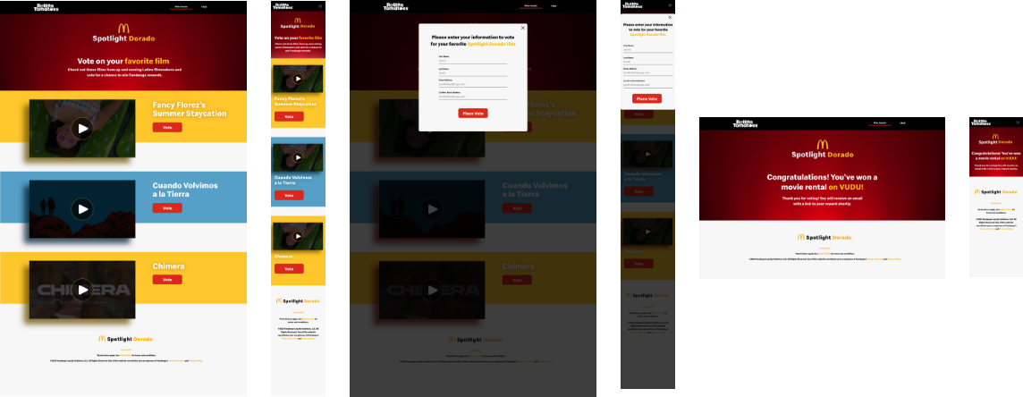
This project involved creating pre-sales UI/UX mockups for a proposed collaboration between McDonald’s and Vudu (now Fandango at Home). The concept centered around an interactive movie voting experience where users could vote for their favorite films and earn a free movie as a reward. The goal was to create an engaging, user-friendly digital experience that combined entertainment, gamification, and rewards while strengthening brand engagement and encouraging adoption of the streaming platform.

Balancing Brand Identity & UI Design
Balancing Brand Identity & UI Design
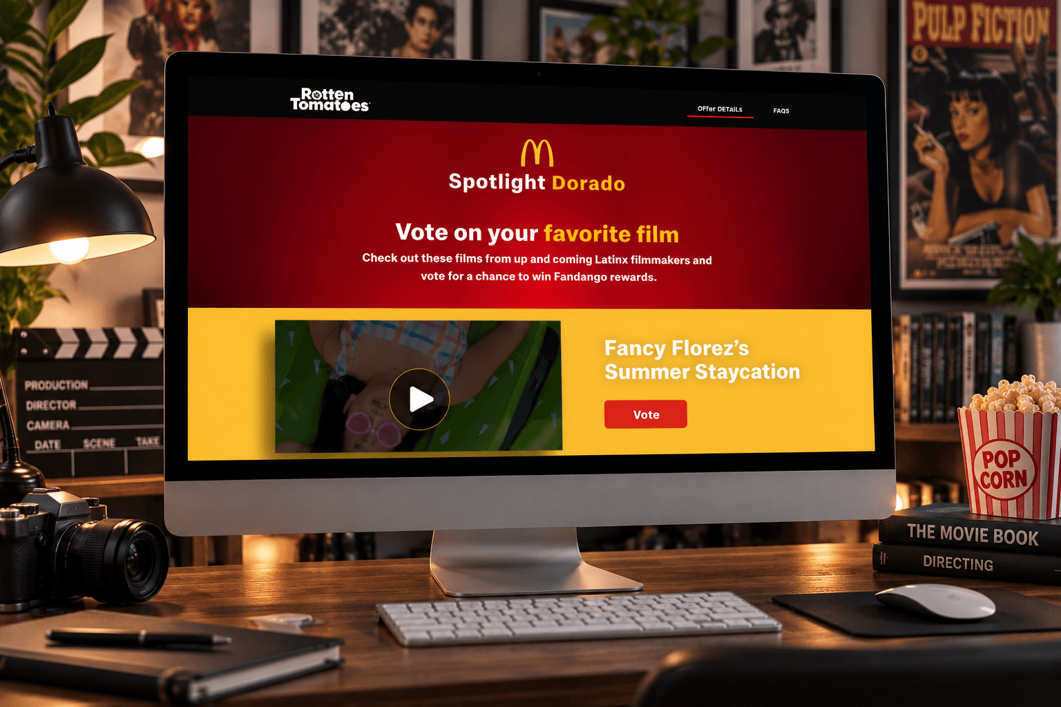
One of the key design challenges was creating an experience that felt native to Rotten Tomatoes while adhering to McDonald’s established brand guidelines. I incorporated McDonald’s signature colors, typography, and visual elements while drawing inspiration from Rotten Tomatoes’ familiar layout and user interface. The goal was to seamlessly blend both brands into a cohesive, engaging experience that felt authentic to Rotten Tomatoes while maintaining McDonald’s strong brand presence throughout the campaign.

Designing a Mobile-First Voting Experience
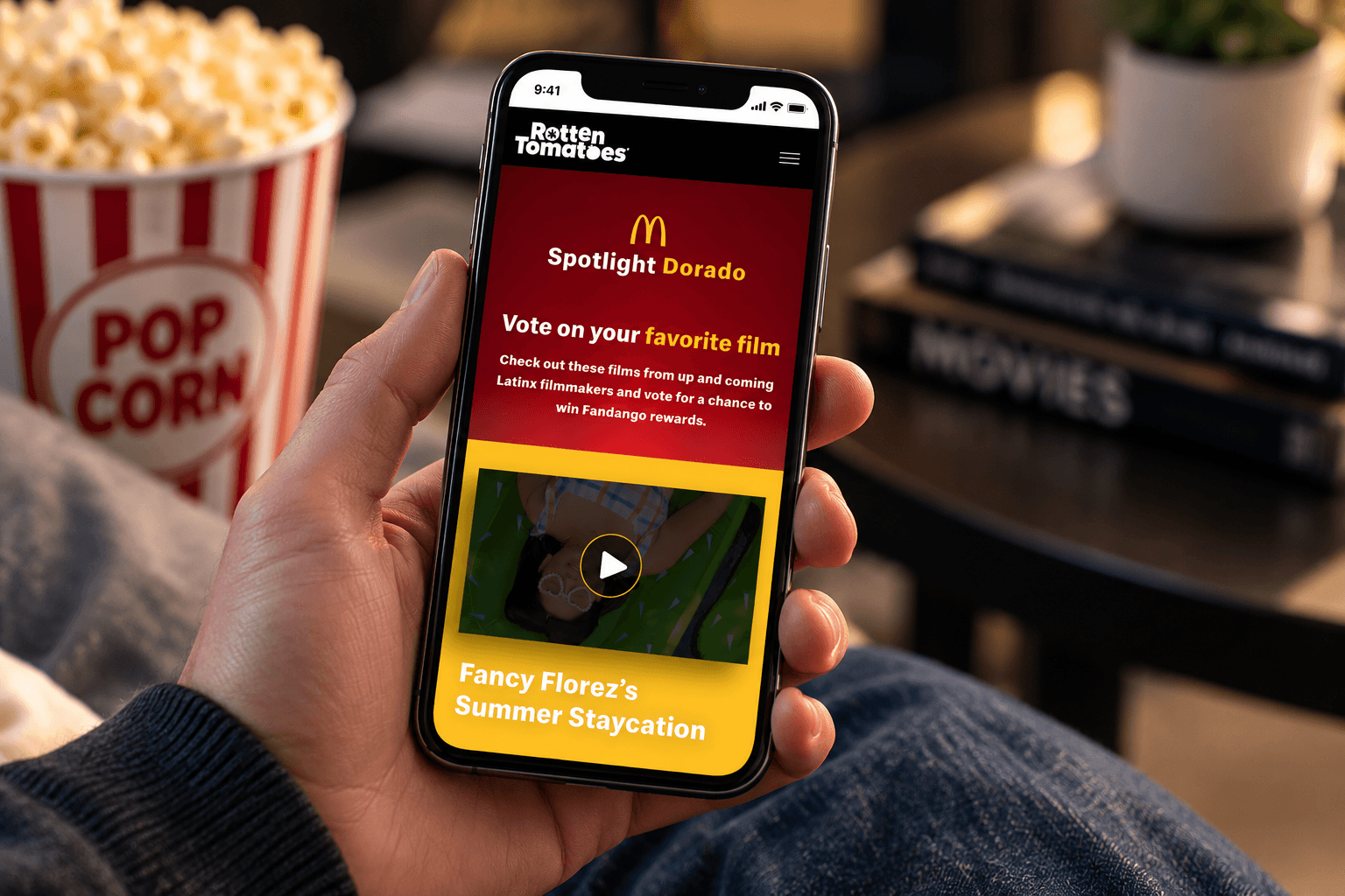
With the campaign centered around interactive film voting, creating a seamless mobile experience was a key priority. I focused on designing responsive layouts, intuitive voting interactions, and clear calls to action that made it easy for users to participate on any device. Using Figma’s Auto Layout, reusable components, and variants, I created consistent UI elements that adapted across different screen sizes. I also used Figma’s interactive prototyping tools, including Smart Animate and interactive components, to demonstrate voting interactions, transitions, and user flows. This allowed me to refine the experience and communicate how the final design would look and function before development.
SITEMAP & WIREFRAMES
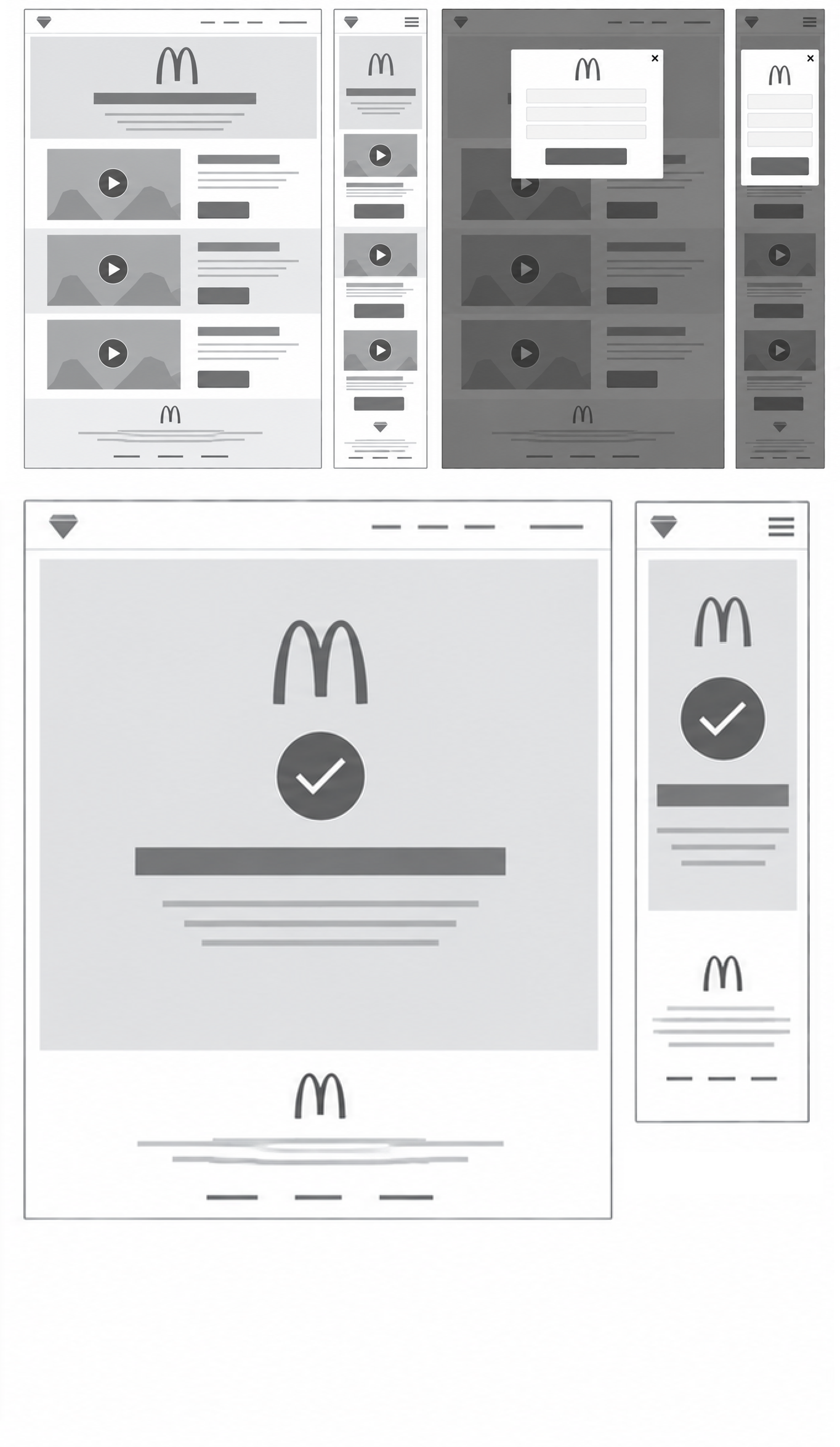
I worked on planning the site structure and user flow for the interactive film voting experience, focusing on creating a clear path from browsing movie selections to casting a vote and receiving confirmation. The sitemap helped organize content and define key interactions, while low-fidelity wireframes established page layouts, visual hierarchy, and responsive behavior across desktop and mobile devices. Using Figma’s Frames, layout grids, and reusable components, I explored different layouts and refined the placement of video thumbnails, voting buttons, and form interactions. I also used Figma’s prototyping tools to connect wireframes and visualize the voting process before moving into high-fidelity design. This helped identify potential usability issues early and establish a solid foundation for the final experience.